Week 1 : Item Wording/Vetting and Partial Correlation
Learning Objectives
When you have completed this workshop, you should be able to:
- Understand the need for careful wording in questionnaire design, distinguishing between different question features that must be considered.
- Distinguish between well-worded and poorly-worded items.
- Create a scatter plot in Jamovi to observe and describe relationships between variables.
- Create a scatter plot in Jamovi to observe and describe the relationship between two variables when data are grouped by a third variable.
- Conduct bivariate correlation between pairs of variables in Jamovi, interpret the output and write-up the findings.
- Conduct partial correlations between two variables in Jamovi, interpret the output and write-up the findings.
- Examine correlational data using scatter plots to make decisions about how to test the relationship between variables.
Item Wording
Here is a list of things to bear in mind when writing questionnaire items. Read through and make sure you understand each potential limitation and how to avoid them
Things to bear in mind: Explanation :
| Things to bear in mind: | Explanation: |
|---|---|
| Use simple language | Avoid jargon, complicated language or technical terms, keep it simple so anyone can understand |
| Keep questions short | Long questions confuse/bore participants, keep questions as short as possible |
| Avoid double barrelled questions | Asking two things in one question confuses participants and produces meaningless data. If you want to ask two things, split in to two questions |
| Avoid leading questions | We want to know what our participants think and feel, we do not want our own thoughts reflected back at us because we have led participants. Don’t imply one answer is ‘right/better’ |
| Avoid double negatives | “I never was, nor neither will be…” Double negatives are confusing and confusion leads to meaningless data. Consider wording carefully. |
| Is the respondent likely to know the answer? | If the question is knowledge-based, participants should be able to answer. Keep in mind what your participants can be reasonably expected to know based on who they are. |
| Are the meanings of words clear | Some words have more than one meaning, so you need to make sure that meaning is clear. For example, a bat can mean a flying mammal, a cricket bat, to hit something away etc. |
| Avoid ‘prestige bias’ | The perceived prestige of a person, brand, job etc can influence how we respond to questions about them. Avoid implying that something or someone is superior if you want to obtain genuine responses |
| Avoid ‘conformity bias’ and social desirability | We often conform to behaviours we think are most common or most desirable but this might not be a true reflection of what participants actually do. Emphasise the importance of understanding their normal behaviour/attitudes, not what they think they should be doing/thinking |
| Avoid ambiguity | Just like words can have more than one meaning, questions can often be interpreted several different ways. Make sure your question is clear and participants know what they should be doing |
| Is the context clear? | Words and questions can have different meanings in different contexts, it should be clear which context you are asking about |
| Avoid questions that create opinions | Questionnaires should be designed in a way to explore what participants think and feel, we should not be trying to change how they think or feel (interventions for behaviour change come after understanding) |
Look at the list of questions/items below that were designed to explore life as a student. A participant would respond with their level of agreement to the items below using a 7-point Likert scale ranging from ‘strongly agree’ to ‘strongly disagree’. Read through the items and see if you think any should be removed or re-written. Make a list of alterations (15 min)
- I carefully considered other options before choosing to come to university.
- By working diligently, students earn the minimal funding they receive.
- It is not the case that students are not as well off as they used to be.
- Like successful graduates, I believe students should pay for their own education.
- Radical politicians should be allowed to cut student incomes to poverty levels.
- University will provide me with either a wider view of life or a new path in life’s big journey.
- One hundred pounds is a good amount.
- University life is providing me with new opportunities.
- My degree is the most important area of my life.
- Indolent student politicians are responsible for decimating maintenance grants.
- I balance my studying and socialising well.
- I make an important contribution to the University community.
- After getting my degree I will have a better chance in the British or international job market.
- It is an honest person that believes all education should be free
- Free education is an important cornerstone to our society.
- I believe that students should receive more financial support.
- Questionnaires about student opinions are a waste of time.
- When I started at University I believed I would ultimately improve my quality of life by undertaking further education.
If you are not sure about any of these you can ask staff in your workshop, but ultimately you will need to make the decision because you need to be able to defend the methodological and statistical choices you make.
Review the table of things to bear in mind and consider whether they apply to each of the questions in the list.
Jamovi Tasks : Correlation
Download and open the data file academicsuccess from Canvas. You were shown how to import data into Jamovi in previous research methods modules, if you have forgotten please refer to this page
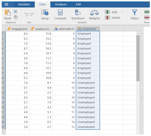
Once open the data should look like this
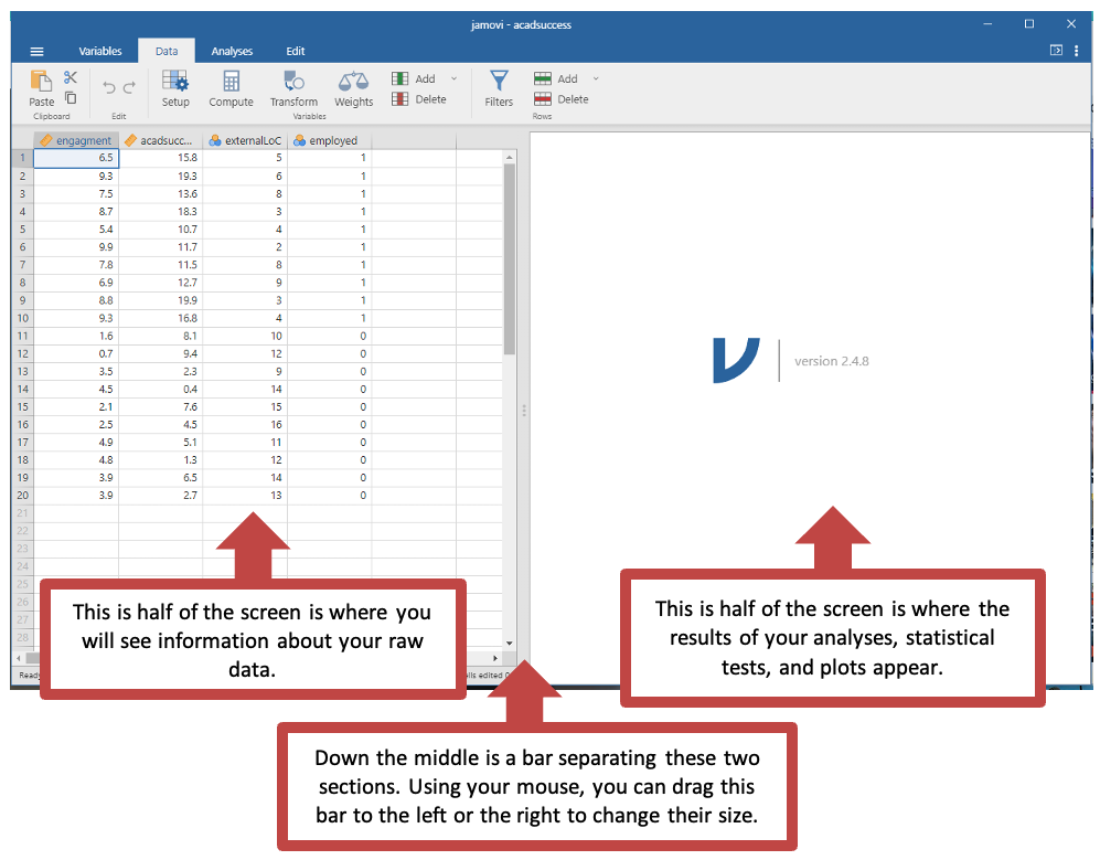
Right now, you are in data view. The data are fictional and created to show that students who are more engaged in their studies are more likely to be academically successful than students who are less enagaged.
The data has four columns:
- engagement - how engaged the students are in their studies
- acadsuccess - rating of academic success
- externalLoC - self reported external locus of control (sometimes referred to as Externality)
- employed - which participants were in employment after graduation
You are going to test this hypothesis with a correlational analysis which you should be familiar with from earlier modules.
Changing the variable type
Here we will show you how to amend the type of data each variable represents in Jamovi.
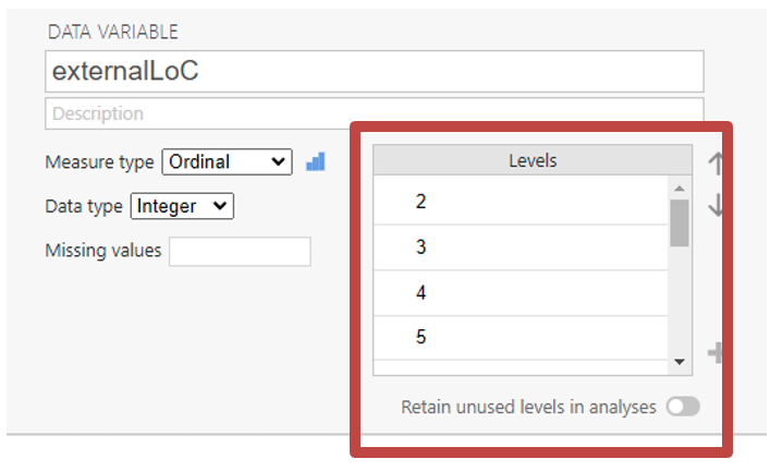
Click on “Variables”. Here you can see all of your variable names. The symbols next to the name of each variable tells you what type of data Jamovi has stored this variable as (ordinal, nominal or continuous).
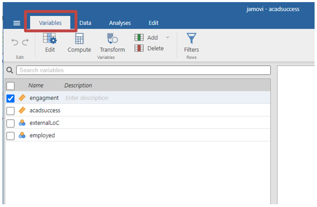
If you double click on the variable name, a new section will appear which lets you edit them.
You can change the name of the variable, the type of measurement (nominal, ordinal, continuous, or participant ID). You can state if the data type is text, and integer, or allows decimals.
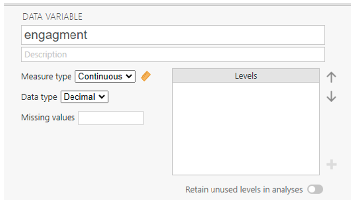
If data is nominal or ordinal, you can include levels. Levels are the possible options people have to choose from. For example, responses on a Likert scale or saying if they are employed.
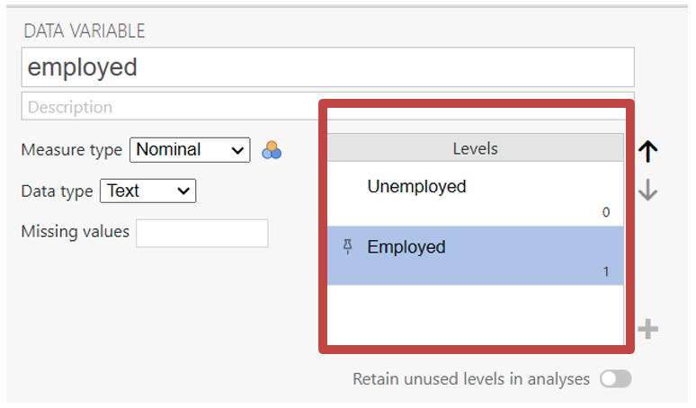
Click “Data” on the top of screen to go back and view the raw data.
Creating a scatter plot with Jamovi
Before correlating two variables, it is always a good idea to produce a scatter plot of the relationship between two variables. Scatter plots help you to decide which method for calculating a correlation coefficient to use. Scatter plots also tell you if you should perform a correlation analysis at all.
Each point on a scatter plot represents an individual in the sample. The point’s position on the X and Y axes corresponds to that individual’s scores on the two variables.
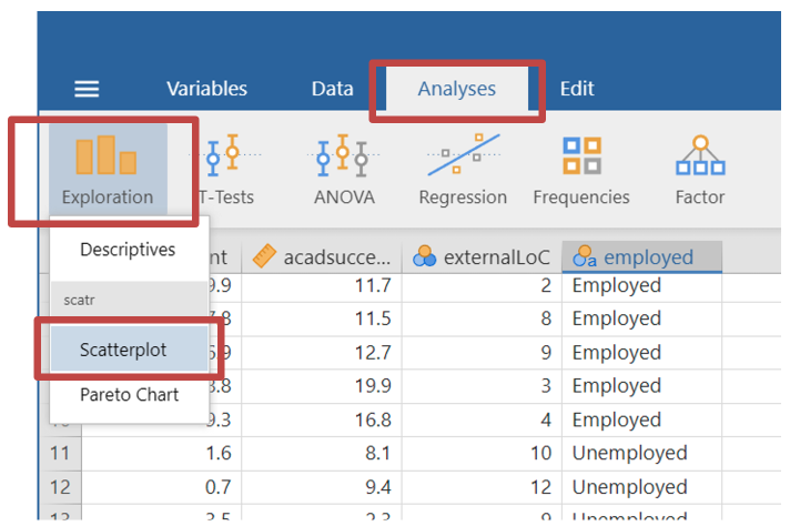
- Select analysis -> exploration -> scatterplot
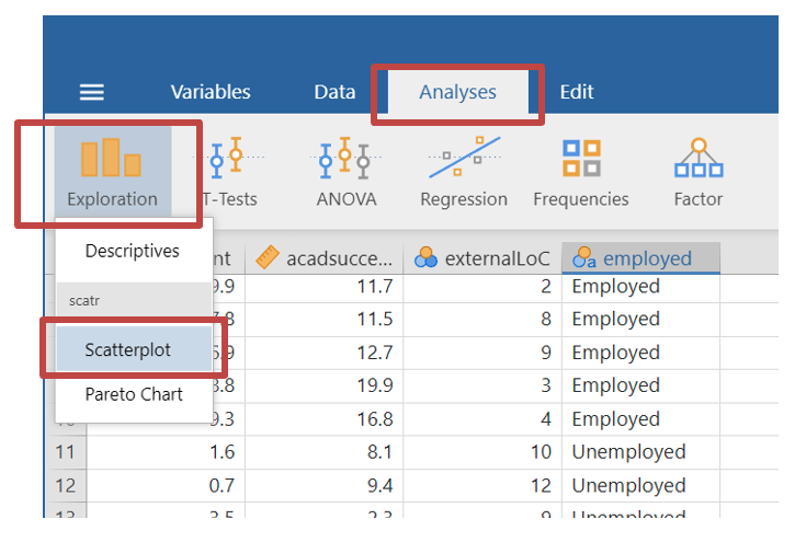
- You will see your variables in this screen. Move the “engagement” and “acadsuccess” variables to the x & y axis. You can do this by dragging the variable names to the x / y axis box, or selecting the variable and clicking the arrows next to the box.
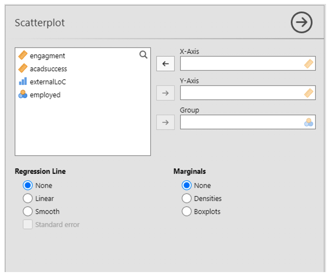
- Once you have populated both x and y axis labels, the scatterplot with automatically appear.
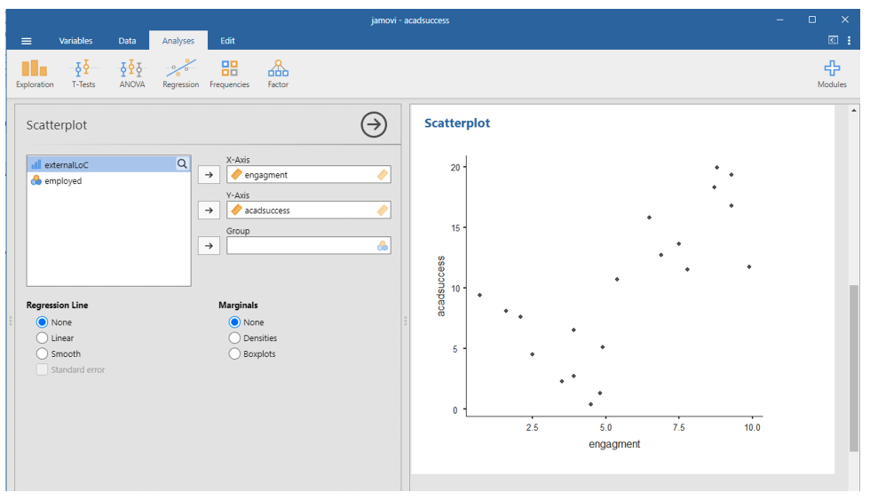
Is the relationship approximately linear?
Is the relationship likely to be strong?
Is the relationship likely to be positive or negative?
Are there any obvious outliers?
Calculating the correlation coefficient
The scatterplot does not show if the correlation between the two variables is statistically significant. We can test this in the following way:
- At the top of the screen select analysis -> regression -> correlation matrix
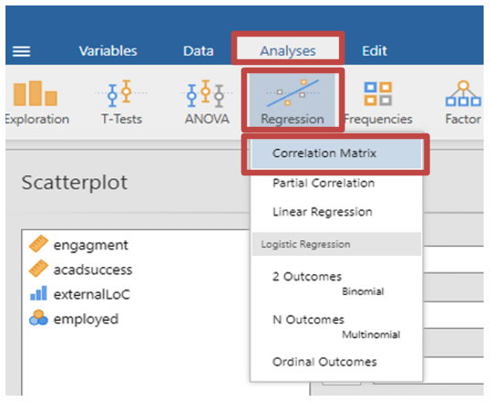
- A new window will appear
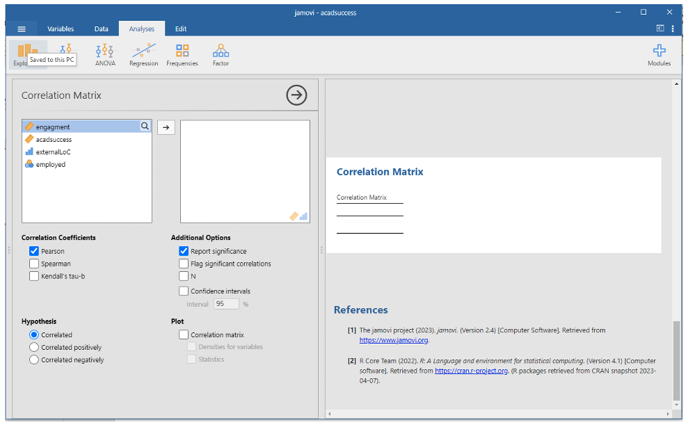
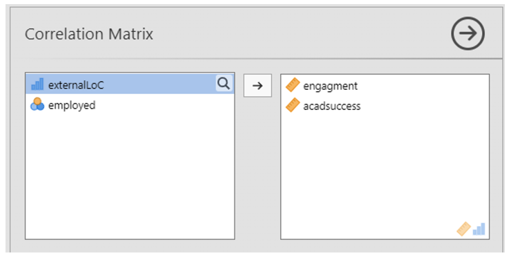
- In this window move your two variables (engagement and acadsuccess) to the empty box.
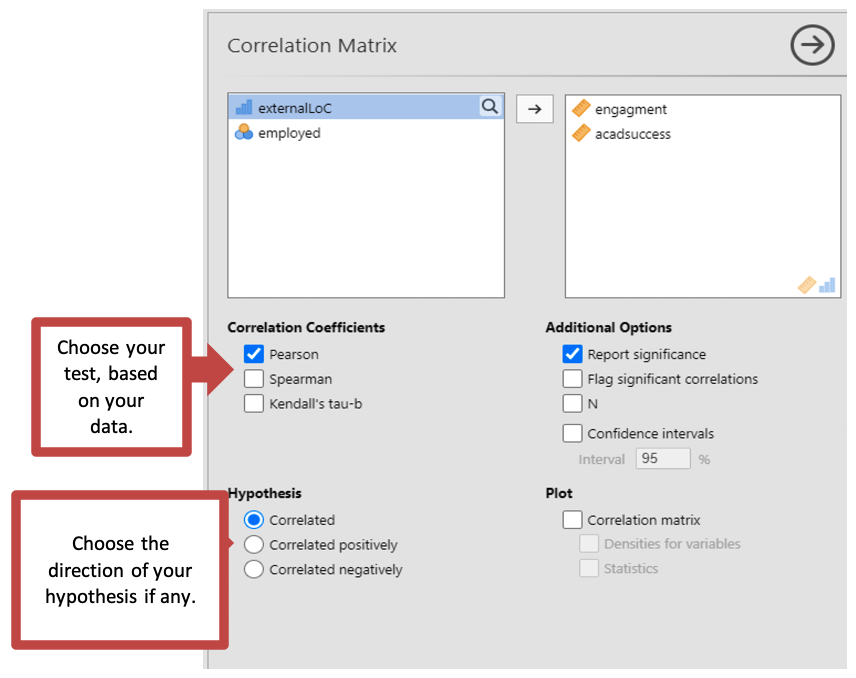
Jamovi will automatically populate your results based on a default statistic. However, you must make sure the correct parametric test has run. Underneath the variables box, you will see an option to select from different tests.
Correlation coefficients: You have the option to choose Pearsons if your data is suitable for parametric analysis. For non-parametric analysis you have the option to select Spearman or Kendall’s tau-b. For this data click Pearsons.
Hypothesis: If your hypothesis has direction of prediction such as a positive or negative correlation between the two variables, you can select either “Correlated Positively” or “Correlated Negatively” as a specific test. If you have no prediction as to the direction of the relationship, you can keep “Correlated”. For this data we should select “Correlated”.
- The results will automatically load on the right-hand screen as you make your selection.
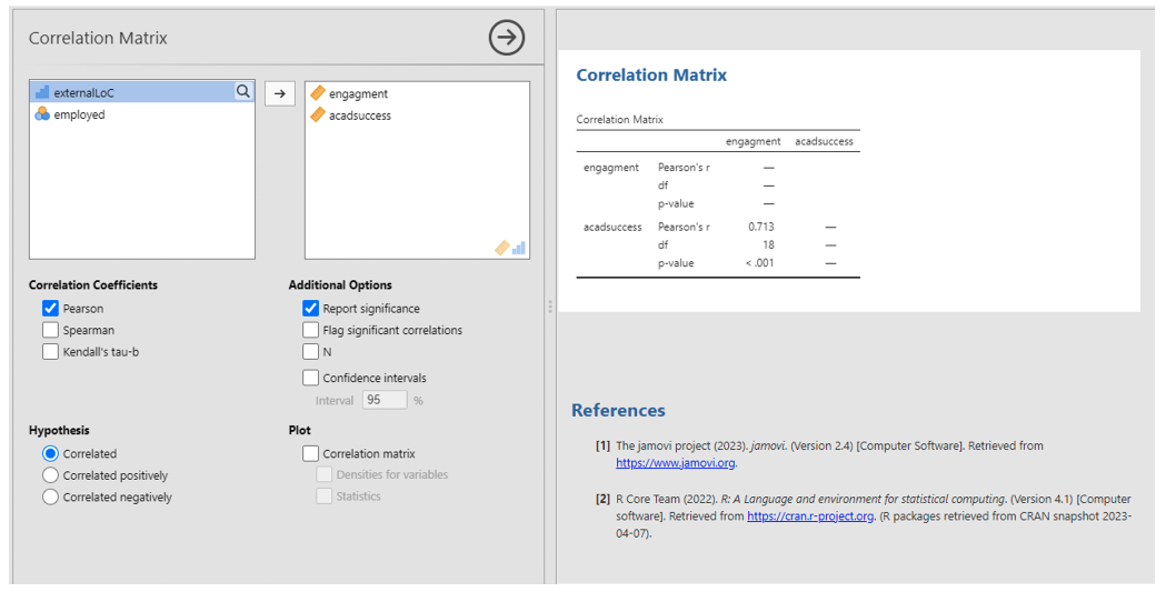
Correlation: Output
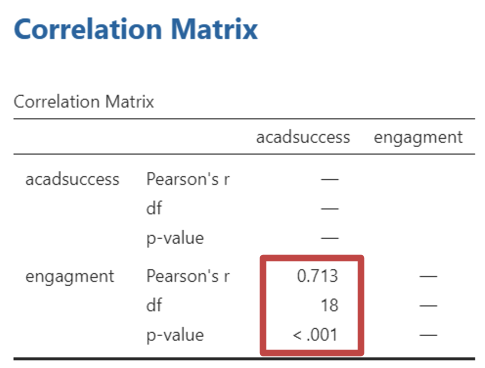
For Pearson’s correlations, you can work out the variance explained in the data by the relationship between the variables by squaring the correlation coefficient. E.g., (0.713)2 = 0.508. Converted to a percentage this is roughly 51% of the variance explained (rounded up)
Writing up Bivariate Correlations
The following is an example of a correlation write-up, using the above example for the correlation between engagement and academic success. Remember that your results might be different if you have cleaned the data in any way (and that is fine – just remember to tell us what you did in your reports).
“Consistent with the hypothesis, there was a strong positive correlation between study engagement and academic success, r(18) = .713, p < .001, two-tailed. The relationship accounts for 51% of the variance observed.”
Run a new correlation analysis to investigate the correlation between externality (external locus of control) and engagement. After that, do the same for externality and academic success. What do you find?
Externality and engagement:
What is the value of the Person’s correlation coefficient?
Is the correlation significant?
If so at what level?
Externality and academic success:
What is the value of the Person’s correlation coefficient?
Is the correlation significant?
If so at what level?
APA Results
There was a strong correlation between externality and engagement, r() = , p , two-tailed. The relationship accounts for % of the variance observed.
There was a strong correlation between externality and academic success, r() = , p , two-tailed. The relationship accounts for % of the variance observed.
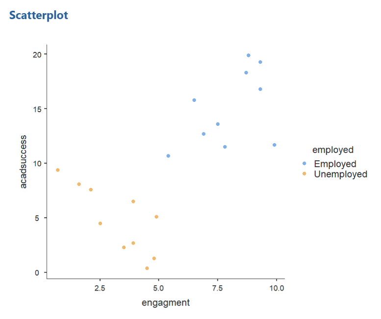
Creating a grouped scatterplot
This section continues to use the academicsuccess data set.
Six months after finishing their degrees, the students in this fictional study indicate whether they were in graduate employment. This information is in the academicsuccess file under the “employed” column.
Your task is to see if the correlation differed for people who were in graduate employment after finishing their degree. To see this, you will need to create a grouped scatter plot.
You should have already loaded the academicsuccess file. The steps are mostly the same as when you created the correlation coefficient in the previous section.
Select analysis -> exploration -> scatterplot
- In the x and y axis place the variables “engagement” and “acadsuccess”. In the group section place the variable “employed”.
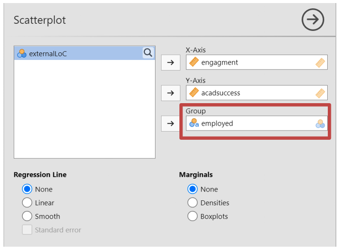
- Jamovi will display a new scatterplot where employed and unemployed participants have their own colour to identify their group.
Performing a partial correlation
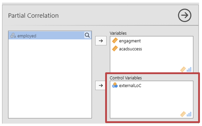
The academicsuccess datasheet contains three continuous variables, the third being externality (labelled “externalLoC”). Externality is correlated with both engagement and academic success. It is possible that the apparent relationship between engagement and academic success is completely due to the relationship that they each have with externality. That is, externality might be acting as a mediating variable between the other two. Alternatively, the relationship between engagement and academic success might have little to do with externality. We can test this by performing a partial correlation which lets us see what the correlation between two variables (here engagement and academic success) would be if we were to hold a third variable (here externality) constant.
- At the top of the screen select Analysis -> Regression -> Partial Correlation (ensure that the academicsuccess data set is loaded into Jamovi)
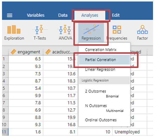
- Drag the “engagement” and “acadsuccess” variables into the “Variables” box
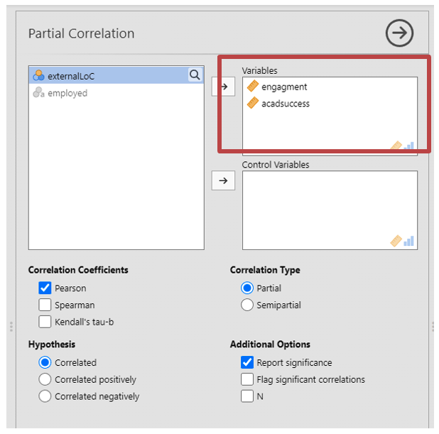
- Drag the “externalLoC” variable into the “Control Variables” box. This tells the analysis which variables you are controlling for.
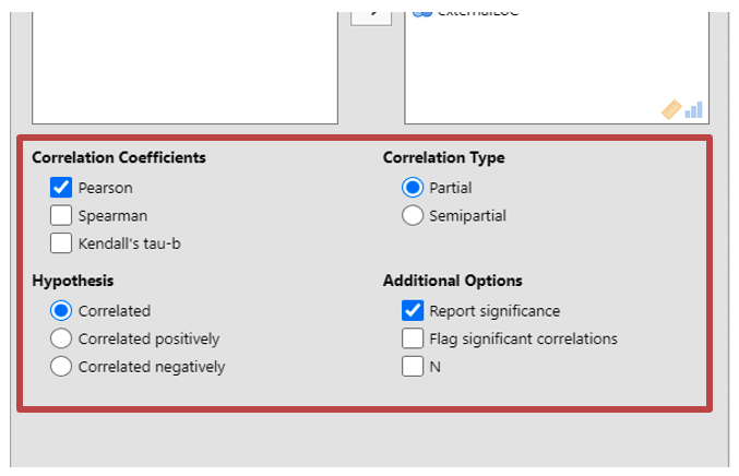
Underneath the variable sections, you can select the type of test you want to run. You must make sure the correct parametric test has run.
Correlation Coefficients: You have the option to choose Pearsons if your data is suitable for parametric tests. For non-parametric tests you have the option to select Spearman or Kendall’s tau-b. For this data click Pearsons.
Hypothesis: If your hypothesis has direction of prediction, such as a positive or negative correlation between the two variables, you can select either “Correlated Positively” or “Correlated Negatively” as a specific test. If you have no prediction as to the direction of the relationship, you can keep “Correlated”, which you should select for this data.
Correlation type: A partial correlation will measure the relationship between two variables, when controlling for another variable. A semipartial correlation will correlate the variable you are controlling for with just one of other variables, to see if that influences the relationship the remaining variable. For this data you should use a partial correlation.
Additional options: tick “report significance” to see the P value for every correlation. Note that this test does not calculate degrees of freedom, so you will need to tick “N” for when you do this further below.
- You can now interpret the results that are presented
Calculating the degrees of freedom for partial correlations
Jamovi does not give you the degrees of freedom (df) in partial correlation analysis. You will need to calculate it manually using the equation below (see explanation in bullet points).
\[ df=n-k-p \]
n: the number of datapoints or observations. You can see this by ticking “N” under “Additional Options” in the above analysis. As Jamovi is dynamic, you will be able to see the number of data points (20) appear in the partial correlation matrix.
k: the number of variables, including the control variables. In this case we have 3 variables in the partial correlation (“engagement”, “acadsuccess” and “externality”)
p: number of parameters that are being used. Here we are measuring one coefficient between “engagement” and “acadsuccess”. You are then measuring a second coefficient between the two variables and the control variable, externality (note this second parameter is not included in semipartial correlations). Therefore, here the parameter is 2.
With this calculation you can confirm that the degrees of freedom is 15.
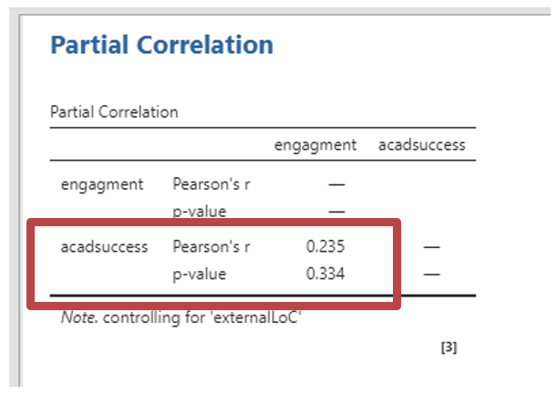
Writing up partial correlations
The following is an example of a partial correlation write-up. It refers to the above example for the correlation between engagement and academic success, controlling for externality.
“When externality was held constant, the partial correlation between study engagement and academic success was not found to be significant, r(15) = .235, p = .334, two-tailed. The results suggest that academic success is unrelated to study engagement when controlling for externality.”
Using Jamovi to Carry out Multiple Correlations
Jamovi can easily calculate correlations between several pairs of variables at once. Download and open the stress data file on Canvas. The file contains made-up data of 100 people. Variables include:
Stress – How much stress participants experience
Age – Participants age
Work_Hours – The number of hours participants work per week
Children – The number children participants have
Leisure - The amount of money participants spend on leisure per week
Exercise - The amount of time per week participants spend exercising
Salary - Participants’ salaries.
Calculate Person’s correlations for all pairings of the variables.
You can do this by adding all of the variables into the correlation dialog box at once. The steps are the same as when you calculate the correlation coefficient, as shown above.
- At the top of the screen select Analysis -> Regression -> Correlation Matrix
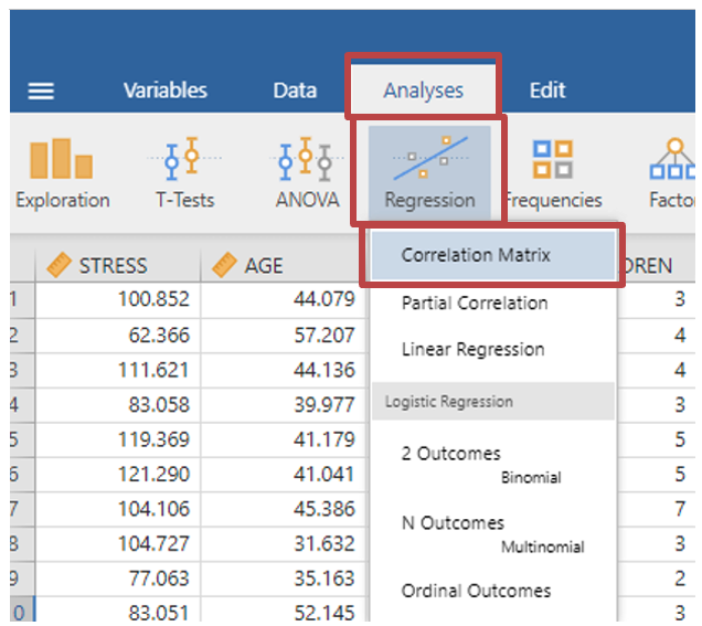
- When selecting your variables, rather than just selecting two variables, select all of them.
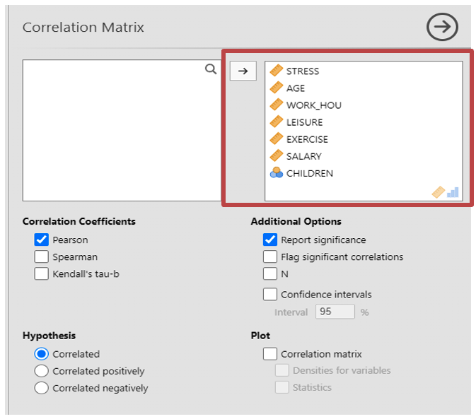
Make sure you select the correct tests as explained in correlation coefficient section. Read the above steps again to remind yourself what they are.
You can tell which pair each entry in the correlation matrix applies to by looking at the row and column headings. Since the order of variables in correlation makes no difference, only one ordering needs to be recorded for each pair when reporting multiple correlations (e.g. it is fine to report salary correlated with exercise, you don’t need to also report exercise correlated with salary). See the table below for a basic layout for a table of multiple correlations. The first column shows the correlation coefficients for stress versus each of the other variables in turn. [NOTE: The table is not presented in APA format]
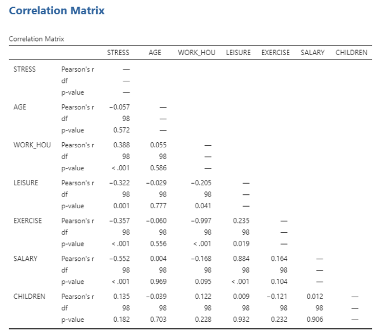
Answer the following questions based on the table above
Are the following correlations significant at the .01 level? (i.e. p = .01 or p < .01)
Stress and age:
Stress and work hours:
Stress and leisure:
Stress and exercise:
Stress and salary:
Stress and children:
Age and work hours:
Age and leisure:
Age and exercise:
Age and salary:
Age and children:
Work hours and leisure:
Work hours and exercise:
Work hours and salary:
Work hours and children:
Leisure and exercise:
Leisure and salary:
Leisure and children:
Exercise and salary:
Exercise and children:
Salary and children:
Which variable relates most strongly to the amount of money spent on leisure?
What percentage of the variance in the data is explained by this relationship? %
Complete the following sentence to describe this correlation as if in a report.
There was a strong correlation between and money spent on leisure, r() = , p , two-tailed.
Age and Stress
Create a scatterplot of the relationship between Age (x) and Stress (y) and answer the following questions.
Is the correlation coefficient for Age and Stress significant?
Is correlation an appropriate test for measuring the relationship between Age and Stress?
Why?
Fill in the sentence below to report the correlation as if for a report. Think about any cautionary notes that you think should be applied.
There was correlation between Age and Stress, r() = , p = , two-tailed.
Different correlation coefficients: Running speed and heart rate
Download and open the speed data file. Imagine that the resting heart rates of 10 people have been measured. The time taken by each person to run 100m is also measured. The theory is that fit people will have low resting heart rates and will also be able to run quickly. Create a scatter plot for this data.
Calculate both Pearson’s and Spearman’s correlation coefficients.
What is the value for Pearson’s correlation for these variables?
What is the value for Spearman’s correlation for these variables?
Are either of the coefficients significant?
Which correlation coefficient is the most appropriate for this data? Remember that you will need to decide based on the data in front of you (does it meet parametric assumptions?)
Fill in the sentence below to report the correlation as if for a report.
There was correlation between speed and heart rate, ρ() = , p = , .